
When it comes to web design, the minimalist approach is quickly becoming a favorite among designers and users alike. Reducing clutter and focusing on essential elements not only improves functionality but also enhances user experience. Let’s delve into the world of minimalism and discover how it can transform your website.
Embrace the White Space
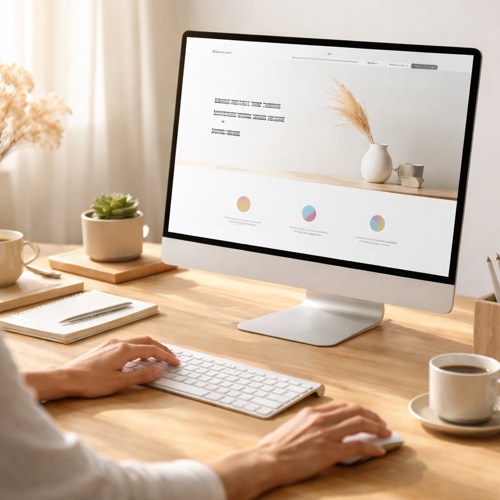
One of the core principles of minimalist web design is the strategic use of white space. By allowing elements to breathe, you create a visually appealing layout that directs the user’s attention to what truly matters. White space isn’t just empty; it’s a powerful tool that can enhance readability and make your content stand out.
Avoid Unnecessary Elements
Every element on your website should have a purpose. This means getting rid of anything that doesn’t serve a functional or communicative role. Buttons, images, and text blocks should all contribute to the user’s journey or convey essential information. This approach not only speeds up load times but also creates a more direct pathway for user interaction.
Optimize Typography
Typography is more than just choosing a font. In a minimalist design, typography must be clear and legible. Opt for clean, sans-serif fonts that can be easily read across different devices. Limit font variations to create cohesion across your site, but don’t be afraid to play with font weights and sizes to highlight key information.
Choose a Simple Color Palette
Minimalism doesn’t equate to blandness. However, using a limited color palette can help create a harmonious and balanced design. Stick to a few complementary colors and use bold colors sparingly to draw attention to specific actions or sections like calls to action.
Prioritize Content
Focus on what you want your audience to see and engage with. Content should be concise and effective, with every word serving a purpose. Minimalist design often leverages visual hierarchy and thoughtful placement of elements to guide users naturally through the site.
Streamline Navigation
Users should be able to find what they’re looking for without confusion. Simplified navigation bars with clear labels and logical layouts ensure that finding information is a seamless process. Minimize submenus and only present essential links to prevent overwhelming visitors.
Focus on Mobile Responsiveness
Minimalism is perfect for mobile sites, where space is limited and simplicity is crucial. Scaling your design down to fit smaller screens should never compromise usability. Ensure responsive design principles are in place so that your website looks and functions beautifully on any device.
Implement Visual Balance
Balanced layouts prevent the design from appearing too heavy on one side. Align elements in a grid system and make sure that text, images, and other visual elements are proportionally and evenly distributed across the page.
The minimalist web design ethos is not about stripping away to the point of emptiness but about bringing focus and clarity. By removing what is non-essential, your website can achieve greater functionality and aesthetic appeal. Embrace the challenge of designing a site where every pixel has a purpose and watch as your website transforms into a masterpiece of simplicity and elegance.